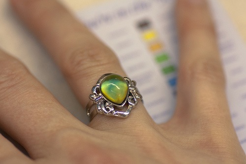
 Sentiment analysis is generating blog headlines again. After reading about the non-response bias of automated sentiment analysis, and that it has no place in social media monitoring, I decided to run a sentiment analysis on sentiment analysis (apparently I like that phrase). I have an account on Biz360 Community from my current project (look for it next week), so I tossed it a quick query and found that the recent buzz was mostly… positive? Hmm.
Here's the thing. Sentiment is not the golden metric. Virtually every social media analysis platform can show you a pie chart on sentiment. At best, it's a first glance—which way is up. Unless you go deeper into the data, all you're looking at is a mood ring.
| Color | Brand Mood | Green | Happy |
| Red | Sad | |
| Grey | Confused |
At the very least, you need to compare sentiment across brands and over time. Yay, it went up! Aw, it went down.
Oh, look, a mood ring. Maybe there's a secret decoder ring somewhere around here that we can wear next to it.
Set aside the methodology question
The automated sentiment debate continues, but I want to focus on what to do with sentiment data once you have it. On scoring methodology, remember that it's not a simple question of human vs. computer (though this Attensity post explains more of the automation than most people have probably seen). Most of the social media analysis (SMA) platforms I've just reviewed allow users to edit sentiment scores, so when you find a post with the wrong sentiment score, you change it. About half of the automated sentiment processors learn from users' changes, too.
But today's topic is what to do with the sentiment data you have.
Trends, segments, and causes
Sentiment, by itself, is a mood ring—a happiness indicator. It's nice to see the happy color, but there's not much information there. If you dig into the sentiment data, though, it starts to contribute to useful analysis.
Take the trend chart. Direction is interesting, but what about slope? Sudden changes are especially interesting. Any spike—not just in sentiment, but in volume or anything else—is the chart's way of saying "look over here." A spike on a chart is a big ol' why, waiting to be asked.
Sentiment really gets interesting when you combine it with other measurements. Most SMA platforms use sentiment scores as a filter for segmenting the data. What are the prominent and emerging topics within negative-sentiment content (and again with positive)? How does sentiment compare within a topic, across different media types or specific sources? Is a topic emerging from a source that writes negatively about you, or is it a friendly source?
Crafting queries and combining filters could be a whole series of posts, or maybe a book. That's why insight isn't automated: what you do next depends on what you find. If you're looking at the mood ring and wondering what it means, you haven't even started.
Join me at the Sentiment Analysis Symposium (New York, 13 April), where I'll talk about how to make an informed purchase decision in social media analysis.

Great reading your blog, as always. "Sentiment analysis" in social media monitoring needs to be carried out on several levels, by human beings, and in coordination with other considerations such as the relationship between the key concepts that you are monitoring.
Like you said, it's the analyses behind sentiment analysis that relate peaks and valleys to specific events, allowing brands to measure specific campaigns, launches, policy changes, etc. People can use free or paid tools to monitor, but there is still legwork to be done. It is also what allows brands to detect differences between different "sentiments". One blog post, for example, may mention a brand as being "always really cool" while sharing their disappointment in a new product or service. Another may mention both positively or negatively, or just one or the other.
Looking forward to meeting up with you soon, Nathan.
Best,
Michelle @Synthesio
Hi Nathan!
First of all, thanks for the Biz360 shoutout!
Secondly, I completely agree with you on several points. Snapshots of yourself are useless unless you are looking at yourself and competitors. Trendlines and rates of change are even better. And most importantly, how you use and interpret the metrics, that's the part that moves the needle. Seeing a pie chart is not going to change anything for your brand. But knowing how to interpret and dig in further and how harness the data for actionable insights - that's what moves the needle!
Cheers!
Maria Ogneva
Biz360
@themaria @biz360