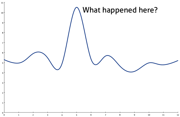
 Everyone loves a chart that answers a key question, but I particularly like the ones that make you think: Why did that happen? What changed? What are we missing? What happens next?
A spike on a chart is a big ol' why, waiting to be asked.
—me, 2010
It's an old point, but a few examples came to me last week. Beyond the immediate interpretation of the numbers (e.g., big number good, small number bad), I think these patterns imply follow-up questions along the lines of "what happened here" and "why did it happen?"
- Spike in a trend
A sudden change means something happened. What? Why? Did the value then return to the usual range? Is the new value temporary or a new normal? Do you need to take some action as a result? The spike is the chart telling you where to look, which I suspect most people do instictively. - Smooth line on a historically bumpy trend
A bumpy trend line that grows more stable is telling you something else, but the follow-up questions are similar. Did the data source stop updating, or is the change real? Remember to watch the derivatives of your metrics, too. If the metric keeps changing but the rate becomes constant, is that real or an artifact of the data collection? What happened, why, what action in response… - Crossing lines
A is now bigger than B; does it matter? Obviously, it depends on what A and B represent, but it's a good place to understand: what happened, why, what it means, how much it matters, and whether to expect it to continue. If it's a metric that people care about, expect to discuss it.
Thinking beyond the graphs, I remembered two things from conceptual diagrams that always make me curious:
- Empty boxes in a matrix
If the framework makes sense, its boxes should be filled in, whether it's the consultant's standard two-by-two matrix or something much larger. An empty box may represent an impossible combination—but it could be a missed challenge or opportunity. I once found $12 million in sales in an empty box, and so empty boxes always get my attention. - Solid lines around a space
A clear definition says as much about what something isn't as what it is. When the definition takes the form of a diagram—an org chart, a Venn diagram, a network graph—I wonder about what's just outside the diagram. The adjacent markets and competitors from the future; the people who are near—but not in—an organization. What does the white space represent, and what does that mean to you?
