How many ways can you visually summarize text? I mean, stats are nice, but visuals soak into the brain so much faster. An ICWSM paper on visual analysis of weblog content reminded me of other examples of ways to depict text.
 The ICWSM paper was presented by a team from Pacific Northwest National Laboratory, who used PNNL's IN-SPIRE software for their visualization. Jeff Clark shows a different text visualization tool on his blog with a visualization of the 2007 State of the Union address. The SOTU is a popular source among text visualizers, because of the interest in identifying themes in the address and the availability of years of data for comparison.
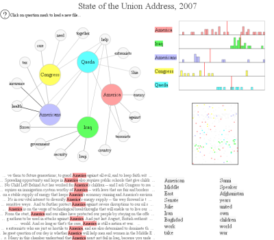
Jeff's visualization illustrates connections between selected terms in the 2007 address and where they appear within the text. An interactive version allows users to explore their own selected terms within the text.
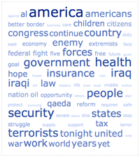 Jason Griffey used TagCrowd to create a tag cloud (text cloud?) for the same SOTU address. This simple visualization illustrates the frequency of the most-used words in the text (with a filter to omit the uninteresing words, such as articles and conjunctions). The cloud doesn't offer as much insight as other visualizations, but it can offer themes at a glance when it works, and the cloud text lends itself to a drill-down application.
Brad Borevitz created an interactive site that compares every SOTU address since 1790. Click on a the timeline, and the cloud adjusts to that year's address. Full text of each address (with the selected term highlighted) and links to historical context are all part of the fun, but the easiest chuckles come from the relative length of the addresses. Can you identify the presidents with the longest addresses without looking?
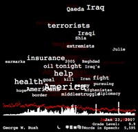 Style.org has a SOTU parsing tool that highlights search terms in a greeked-text view of multiple addresses. Pick a keyword and see where it appeared in multiple years.
Text visualizations are more than just eye candy. Ed Schipul created keyword density charts to identify themes in recent addresses. He suggests a similar test for writers to see if they're staying on message. His keyword density analyzer creates the data from any web page.
Robert Kosara has links to more examples in visualization sets information free.
Tags: text analysis visualization

Nathan,
Interesting. What have you seen on pattern matching to mine context and / or determine sentiment? Perhaps a tool that does what companies like buzzmetrics appear to do with people?
As I'm sure you're aware, there appear to be companies in adjacent research markets that are now branching out into internet text mining. I saw a presentation from such a company yesterday that was primarily a survey and regression modeling service for websites to help tune to better accomplish primary business objectives, but this company also introduced rational text mining capabilities to provide qualatative and quantitative analysis of the blogosphere. My guess is that for those that already have propritary tools to extract data from respondent open answer questions, can funnel rss feeds into the same tool to render analysis of blogs, forums, etc.
Hi, Mark.
Every company I talk to does topic detection in social media, and almost all do some variation on sentiment analysis. The big divide is between those who use software to do the analysis and those who prefer human analysis. We can talk specifics offline.
The observation that companies will enter the social media analysis space from different directions gave me some of my earliest questions. It's not quite playing out the way I expected, but I am seeing some interesting examples of different, specialized services based on essentially the same data. As for the different tools that can be used to analyze social media, finding them is the major point of my project.
Hi Nathan,
You have selected some interesting examples of text visualization.
My feeling about these is that we should move towards cross-validating graphical representation techniques. After all, they are intended to be models of the meaning in the text. Most data miners are aware that models should be cross-validated, or they are just artifacts with no way of telling which are faithful representations of knowledge and which are not.
One approach I have taken for this is to take two texts which should have very similar meanings but differ in: language, author, structure, or vocabulary. Meaningful maps of the two parallel texts should show similar patterns.
Our work in this regard has appeared in Behavior Research Methods
http://leximancer.com/documents/B144.pdf
As a comparison with your collected maps of the State of the Union address for 2007, I created a browsable map using our system. A snapshot is here:
Map_snapshot.tiff
and the full interactive map of the document is here:
http://www.leximancer.com/gallery/State_of_Union_2007/Map/
Thanks for your blog.
Regards,
Andrew E. Smith
Chief Scientist,
Leximancer.